

❋
Multi-Brand Positioning & Refreshed Visual Identities


Overview
❋ The Challenge
Despite being some of the most well-known dating apps of the past 30 years, Spark’s portfolio of brands lacked a modern perspective that translated its niche offerings to today’s more reticent older daters.
❋ The Relevance Unlock
Brand positionings rooted in substance and intention | Safety, quality, value-alignment, and self-expression emerged as core needs across the audiences. We rebuilt positioning and messaging across all four brands, giving daters more control over how they show up and how deeply they engage. For affinity audiences, this meant more culturally attuned narratives that strengthened relevance and belonging.
From volume to quality | Updated product features and UX/UI shifted the experience away from endless choice toward more intentional matchmaking, from onboarding through to matchmaking.
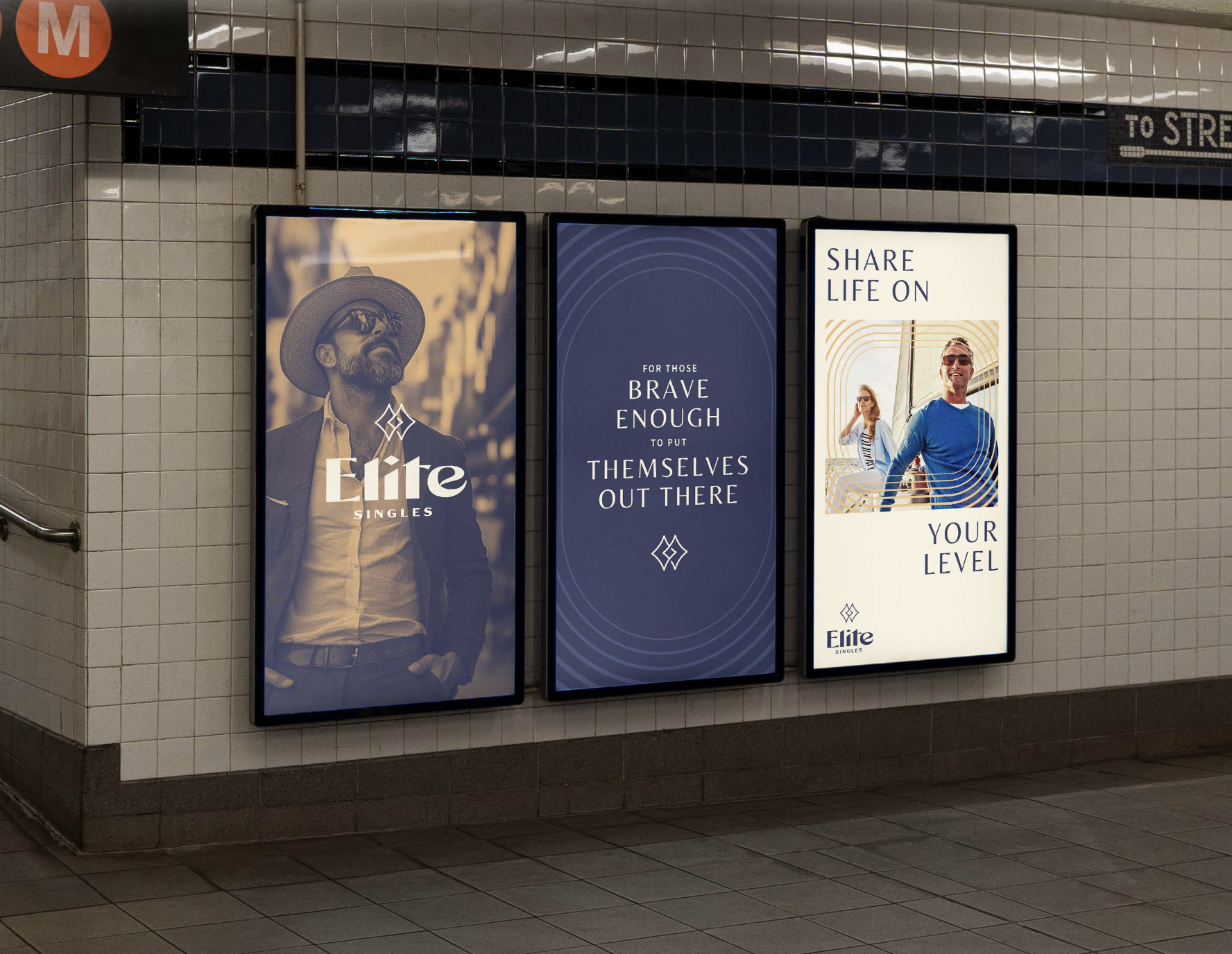
Modernized brand systems | New visual identities refreshed and elevated the overall brand experience, generating renewed interest for new and lapsed users alike.
❋ The Outcome
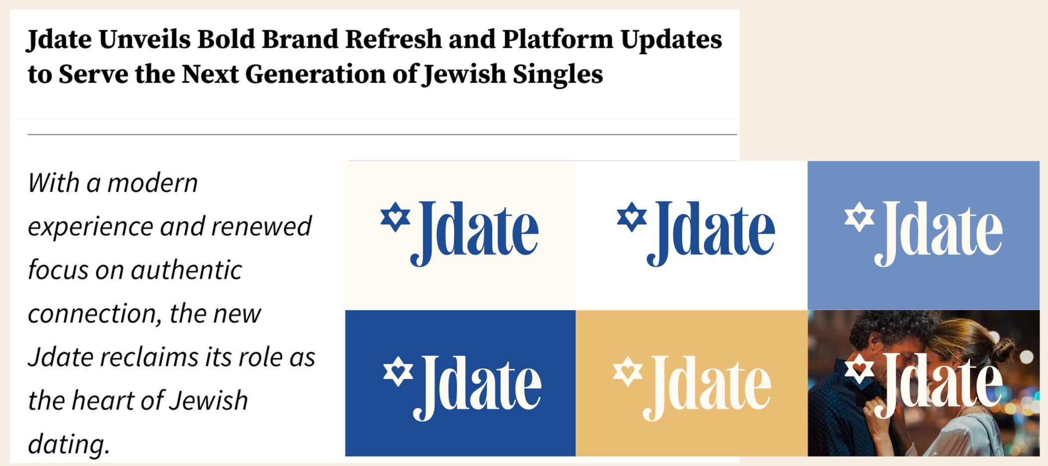
“Surging growth,” as described by the Chief Product Officer, including a 50% increase in DAUs for Jdate since launch. The reintroduction garnered significant press coverage as well as new, top tier partnerships.
What We Delivered
Custom Research
Situation + Opportunity Analysis
Audience Segmentation + Profiles
Strategic Imperatives
Brand Positioning + Pillars
Messaging Strategy + Tone of Voice
Visual Identity
Brand Book + Guidelines
Project Duration: 9-10 weeks per brand
Growth and existing user research painted a picture of a dating environment that left daters 35+, who knew the world before online dating, longing for something more real and less gamified.
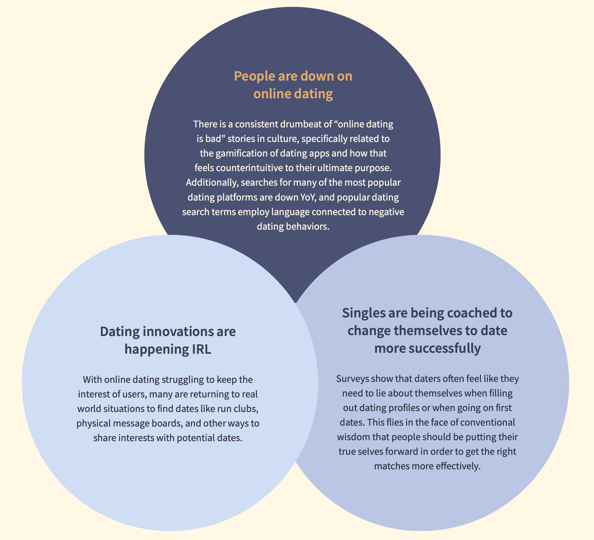
Refreshed brands that respected their legacy, but ready to meet today’s tech and dating demands.
Fully redesigned brand worlds, led by the new positionings and built to feel inviting, aspirational, sophisticated, and modern.

Adam Medros | CEO, Spark Networks
"The Quick Study team was exceptional to work with. They quickly came up to speed on our industry and tackled brand research, positioning, and brand identity work for four different brands in our portfolio. This process took only a few weeks per brand, with a steady pace of insights and iteration. Every step along the way, Alexa and Rob brought data and customer insights and partnered with our internal team to craft a clear positioning and identity for each brand. We're thrilled with the end results."

Anand Savani | Head of Brand & Creative, Spark Networks
"Alexa and Rob were fantastic to work with. We had a multi-brand refresh challenge that needed both strategy and visual work, and the Quick Study approach gave us a strong roadmap for each of our brands as well as a bold, modern new look & feel across the portfolio thanks to their network of partners. If you need to solve a strategic problem quickly, with deep research and insights, there's no other team I'd rather work with."
More Work
Research & Activation Plan for the Super Bowl
Product Positioning & Campaign Strategy for Menswear
Seasonal & Key Moment Strategies
Global Partnership POV & Passion Point Strategies for Music, Cinema, Sport, and Design
Retail Innovation Strategy
Category & Multi-Brand Positioning for Leaders in the Spiritual Wellness Space
Multicultural & Partnership Strategies
Partnership Strategy